Portfolio
User Interface and User Experience Front-end Development Examples
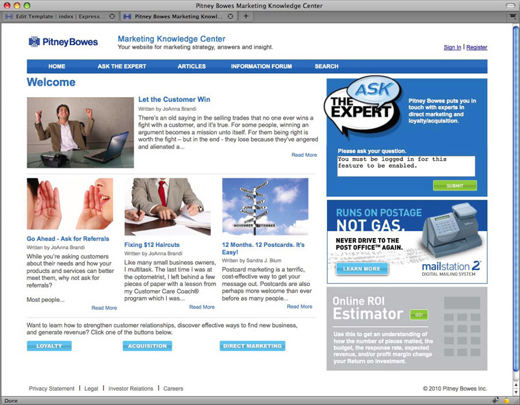
The image to the left is a preview of the landing page for the Pitney Bowes Marketing Knowledge Center. Although the whole project was the collaborative effort of our entire Marketing Department, I handled all of the markup, forms, coding and database work. I also handled a significant amount of the graphics work. Some of the artwork was designed by one of the Art Directors.
The original Marketing Knowledge Center was contained within the Joomla Content Management System. I was tasked with migrating the site’s articles to Expression Engine which is a different content management system. Expression Engine is essentially a “Developers” content management system. There’s a much more significant amount of raw coding required that with the other Open Source CMSs on the market. Our Creative Director wanted our site to be built with unlimited “customizability”. Joomla has come a long way in this area. If I were consulted about switching the CMS now, I would be able to make Joomla work. I did appreciate the experience though. One of the advantages of Joomla is that it’s a much faster from concept to launch than EE.
Radio Buttons Using JavaScript
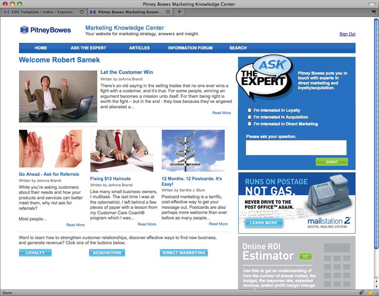
The main draw to the site is free personal marketing consultation from a marketing expert. We have two marketing experts who specialize in different areas. The account manager wanted the end user to be able to send messages directly to the appropriate specialist. I decided to handle this using Javascript. In order to use the free service, the user was required to create an account on the site. I used conditionals to determine whether or not the user was logged in. If the user wasn’t logged in, the text area displayed the message “You must be logged in for this feature to be enabled.” If the user is logged in, the text area is empty and three radio buttons appear labeled with the high level questions.
Email Form Page
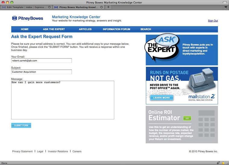
Based on the radio button selected, the user is directed to the appropriate email form page. The user’s email and the question entered in the text area of the home page would be transferred to the text area on the form page.
I used straight JavaScript to direct the question to the appropriate page and PHP to transfer the question content. The subject line would also populate based on the high level question selected. Once the user submits the form, the complete email is sent to the appropriate marketing expert. When the marketing expert responds, both the question and answer appear on the appropriate article page.
Bookshelf Concept

In the next group of previews, I display a little of the creative license I was given on this project.
The first preview to the left is the Adobe Illustrator concept I was given for the bookshelf page. This was to be a page for displaying the books authored by our marketing experts and other books they recommended.
The graphics provided were a good design, but I decided to look for an appropriate API instead of creating the application from scratch and incorporating the graphics.
Bookshelf API

The image to the left shows the API I chose. It’s a Flash based carousel that has a popup window with summarized information about the book. It also directs the user to the book’s information page on Amazon allowing them to read more information or order it.
Search Form with Graphics

The image to the left shows a little more of the creativity I used on this projectg. I chose the magnifying glass from iStock. It was a vector image, so I was able to expand it to the large size shown on the left of the page. I created the reflection below it in Adobe Illustrator. The vertical lettering was another idea that came from the Art Director. I thought it added a good touch. I also used a mini version of the same image for the button to the right of the search field.
Reporting Tool for Sales Leads

I created this reporting tool to help the sales people locate contacts in our forum. I built it with jQuery, JavaScript and PHP. It retreives information from a MySql database. It’s essentially a snapshot showing the forum join date. There are many other columns of information shown in the actual Excel file downloaded.
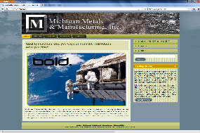
Original Website

The screen capture on the left shows the original landing page for the Michigan Metals and Manufacturing, Inc. website. I was tasked with a redesign.
There are several things I can point out that needed re-designing. I’ll explain just a few for this portfolio. The artist(s) at the design agency mixed 3D elements with 2D. The main navigation was created using 2D buttons and the button to the bottom left is a 3D button with a bevel. Sometimes it’s difficult to remove all inconsistencies due to such things as APIs not being customizable, but there isn’t any reason not to make them consistent here. The font for the menu also had a Gothic look, which doesn’t seem to match the look and feel a technology company on the cutting edge. The site also had a width of 748px., which would have worked ok many years ago when companies use small monitors. Most modern sites have a width of around 1000px. which is more appropriate for any monitor 17 inches or larger. Very few people still use smaller, especially those in the corporate world. They did have some good artwork contained within the site, so I reused as much as possible while still being consistent with the new look.
New Redesign
This image to the left shows the new redesign. I handled the entire project from start to finish. The previous site was a standard PHP based website. I proposed a CMS because they’re a better choice for rapid deployment and the quick adding of content. I also specialize in Organic SEO. One of the most important elements to Organic SEO is repetitive content. A CMS is the best and fastest way to pack a site full of content.
I advised my client that extensive textual content would improve his SEO. The long term plan is to have “Article” pages that contain in-depth information on the Rare Earth Metals industry. Search engines try to provide a user with the most relevant, informative and authoritative search results for their inquiry. Repetitive verbiage using industry related search words is one of the most important elements used for selling a website as an authority on the desired subject matter.
Original Saving Time Website
This image to the left shows the original Saving Time website. It was a pretty basic design with all flat elements and a mostly brown color scheme. One of my aviation instructors told me that if I wanted to buy a cheap airplane, make sure it’s brown because nobody wants a brown airplane. I think you get the point.
Most of the timepieces my client works on are very high-end. I needed to create a theme that was high class. The original content was on the light side, so I decided to leave the content section essentially alone.
New Redesign

This image to the left shows the new redesign. I decided to use Joomla for the CMS. Once I began brainstorming the design, I had three major considerations.
The first was the company logo. The original company logo was straight text in all caps with a radial white outer glow starburst. I’ve seen worse, but thought one that somehow relates to the business would be more appealing. The 2nd consideration was the header. Once I found the right photo for the header, it helped to solidify my decision. The company owner provided me with several photos of clocks and watches he had worked on in the past. I settled on a cross section of one of the intricate clock mechanisms. It contained a good array of colors that were a good match for the rest of the site content. I decided to create a logo in Photoshop that would match the polished metal. The site is still a work in progress, so I just left the main body content the same for the time being. Site updates are coming soon that will allow for a good change in the main body layout.
Trane Holiday Email Blast
The image to the left is a scan of a Trane Email Blast template I created for the 09 Holiday campaign.
I was given a good measure of creative license on this one. The account Program Manager provided me with the copy and the three images in the right column in rough form. The headline read “Don’t leave your customers out in the cold this holiday season”. The header image I chose to convey that message is actually a combination of two different photos I purchased from iStock. The right side was a picture of a window with a normal outdoor scene. The left was that of a jovial family playing in a beautiful winter scene. The thermometer also was a part of the visual imagery. The final result was an important custsomer and his family being left out in the cold.
I used a simple two column layout with the approved corporate Trane colors. The bottom images is another iStock photo.
It’s not very clear from the preview, but the background to the main body copy is a light taupe with a continuation of the snowflakes as a watermark.
Luminique
In email template development, one of the design goals is to keep the file size as light as possible. It’s also helpful to use as few images as possible.
Many mail clients don’t automatically display images unless the preferences are set to do so. That’s why it’s always best to use markup wherever possible. It’s also a good idea to give the alt attribute a description that’s catchy in hopes to bait the customer to visit the site.
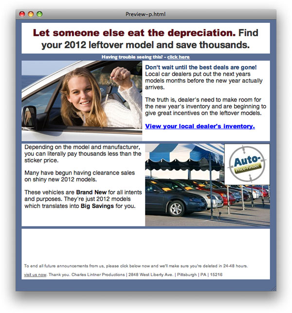
Auto Price Finder – iStock Photos

I chose a happy couple at a car lot for this promotion. It uses a simple staggered image and copy look.
Some of the important copy points and catch phrases have been bolded to allow skim readers to get the high-level message.
Pro Flowers Mother’s Day Promotion – All Table Artwork for Flower

This design actually doesn’t use any images. The flower is a very complex table.
The green symbolizes grass. I chose an elegant script with a few backup fonts to look good on all operating systems.
You’ll also notice that I added the JD Power and Associates ranking to show the customers that it’s a trustworthy website.
Auto Price Finder – Graphical Table

This ad used a representation of primative images using strictly HTML markup, specifically tables with background colors and special symbol arrows.
It shows the work cycle of the tool and simplicity of it’s use.
Free Credit Score Service
This design exclusively uses tables for the design.
My intent for some of the staggered rectangles was to give the appearance of opacity being added to the darker colors.
The other colors are essentially just random.
Pimsleur Language Learning Program
I didn’t put much thought into this design. I just had the idea and whipped it up. It turned out pretty descent, don’t you think?
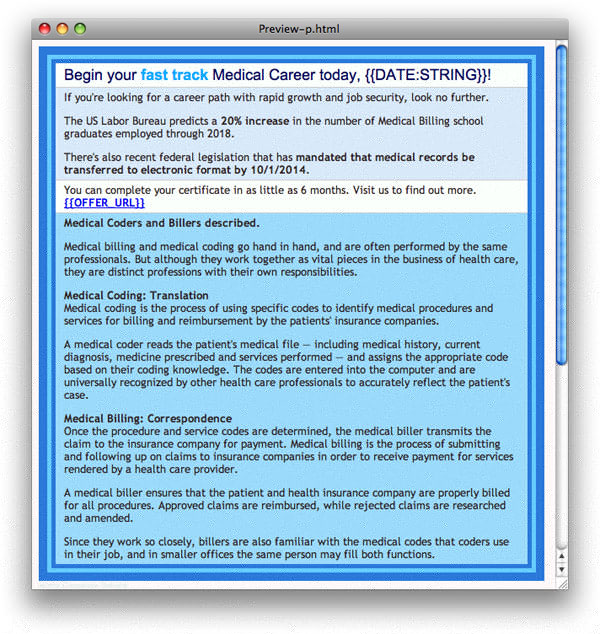
Medical Billing Education

In this design, I endeavored to give it the appearance of a formal business document.
The chart below shows the earnings statistics at the time of the promotion.
Alternate Version of Auto Price Finder with Graphical Table
This is basically a clopy cat of the previous Auto Price template above. Instead of filling in the rectangles, I outlined them with some color. The single arrows were replaced by double arrows.
Free Credit Score Service – All HTML

This promotion did especially well. I think the uniqueness of the vertical copy raised curiosity. I changed the hue in a subsequent version seen below.
Medical Billing Training

This design was actually inspired by a writeup in a science magazine. I like how the dark red lines shoot past their intersections. Something that shouldn’t be able to happen with HTML markup.
The concept is a departure from the formal business-like document I used for previous versions. I also used an unconventional colored background with white copy.
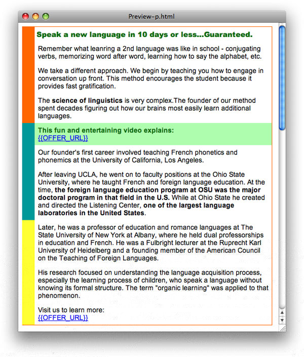
Pimsleur Language Learning
In this design, I just spiced up the rich text with a little color highlighting and colorful rectangles.
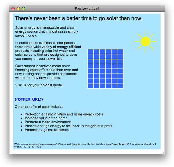
Solar Installation Service – All Table Artwork
This scheme was created using primative shapes. It was created exclusively with table artwork. Similar to pointillism artwork used in paintings.
The images pictured are the sun and solar panels. I simulated the lawn using a basic green single-sided border in css with a heavy width.
Bob Villa Contracting Service
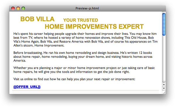
In this ad I used tables to stagger the headline and subhead. It’s basically just a rich text design with a fancy headline. Sometimes simplicity works well in emails.
Auto Price Finder – All HTML with Symbols
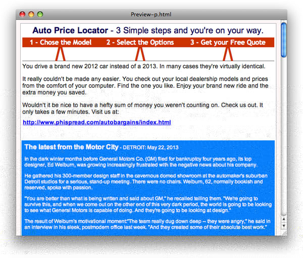
In this example, I created a concept that highlights the simplicity of using the Automotive Locator tool. The upward pointing arrows are just a special symbol markup set at a large "font" size.
The bottom section is simple a current automotive article of interest for car enthusiasts.
Medical Billing Training
This ad just uses a simple tripple border effect created by placing tables inside of tables and setting the border width to varying but similar border sizes.
Zbiddy – All Font Tricks and Symbols – No Images

This was a fun project. The melting font is actually a true font and not an image. The suns are symbols
This lightweight approach makes for an incredibly small file size and I used a reference link to pull the font information from the web. Anyone with internet access will be able to see this as it wasa meant to display. If they are offline, they’ll just see the Arial Black substitue.
Bob Villa Contractor Service – All HTML Table Brick Wall
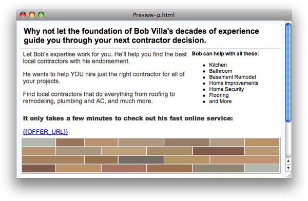
With this project I decided to create a brick wall using all Table artwork.
Again, the absence of images makes for a smaller file size. It also doesn’t get the standard "download images" from the email client when images are used in a design.
Auto Price Finder – All Tables and Special Symbol
My intent behind this design was to provide a visual aid to let the customer see just how easy it is to use the online tool.
I added a "Safety" article to add some small element of value to the email in case it’s already a return customer.
Credit Score Service – All CSS

My intent behind this design was to make it look like a modern online news article.
I added a relevant housing market article below the actual ad.
Online Loan Service – Form Letter Style

This design is meant to immitate an actual printed formal letter.
When dealing with customers entering into financial transactions online, a formal and clean look can sometimes provide legitimacy and professionalism to a company.
Auto Price Finder – All HTML, Symbols & CSS
This design again outlines the simplicity of using the online automotive locator tool.
I used CSS to add the drop shadow and rounded corners to the boxes.
Solar Installation Service – All Table Artwork

This is a very basic design where I again used tables to create the sun image. I haven’t found anything online where this technique is employed, so I think I actually pioneered it.
The whole table background is meant to look like the sky and the thick green CSS border on the bottom is simulating grass.
Angie’s List Contractor Service – iStock Image
I believe this was an iStock image. I matched the background with the ceiling color to give a wider room look.
I monkeyed the banner and the footer from the client’s artwork.
Credit Score Service
This is another news article look similar to the one above.
I chose a relevant article and titled it "Housing and the Labor Market". An advertisement can seem more authentic when it contains relevant content.
Auto Price Finder – All HTML Table Artwork
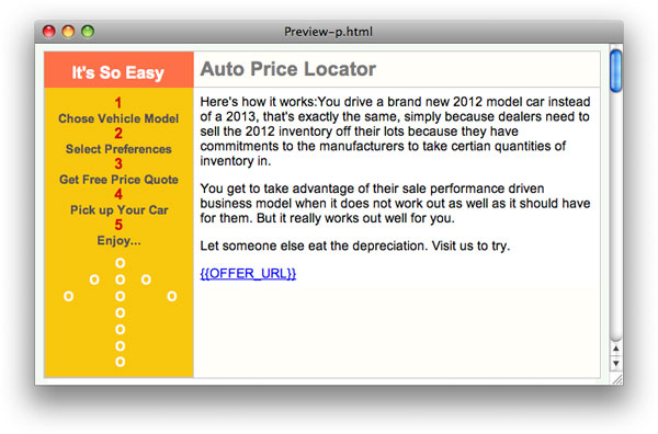
This is another Auto Price Finder ad. I just placed zeros in a bunch of table cells to make the large dotted arrow…more table art.
The first words read from left to right are "It’s So Easy". This works to immediately help ease any anxiety the user might have from the perceived intimidation of complex online applications.
Garcinia Weight Loss – All HTML Table Design
Many times what’s thought up for the web has already been designed in some sort of print advertising, whether that be magazines, brochures, cut sheets, postcards, etc.
Bob Villa Contractor Service – HTML Red Brick Table

This is essentially the same as the brick design above, except I went with red bricks on this one.
The mortar is just default gray table cell borders.
Auto Insurance Quoting Service
Here’s another "fancy news article" design. I added an interesting article about the history of the automobile.
The divider is simply alternating black and white table stripes that look a bit like checkered flag racing stripes.
Solar Installation Service – All HTML Table & Symbol
Here’s another table art design with a primitive shaped solar panel and a large font size special character sun.
It’s essentially the same concept as before done in a slightly different way. It’s important to change the campaigns so that they always appear fresh.
Rich Text Solar Ad with Dual Blue Gradient Background
This solar ad just uses rich text. It’s more like a brief online news article.
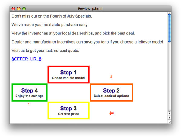
Steps Created with CSS & HTML Table
This was a fun design using a table with partially bordered cells to create steps.
The intent with this style of artwork is to not only look good, but create a picture that represents the wording. It helps a customer remember it better so that they hopefully return to check out the product if they don’t preview it the first go-around.
All HTML Table Artwork for Flower
I employed table art for this Mother’s Day flower service campaign as well.
This style of art creates over a thousand lines of code due to the table’s complexity. It’s obviously not intended to be realism. The point is to have the person say "what is that", oh…I get it…It’s a flower…cool.
Credit Score Service – All HTML & CSS

This template is identical in design to the previous green version.
I simply took a screen capture of the first one, brought it into Photoshop, then changed the hue under "Adjustments". Once I got it to the color I liked, I just used the Dreamweaver eye dropper to change the colors in the HTML version.
HTML Rich Text with CSS Button – No Image
This is just a rich text, blue color scheme layout with a purely HTML and CSS created button.
Tax Representation Service – iStock Photo
This is an all too familiar scene to all of us at some point in our lives. I bought the picture from iStock. When I saw it I though to myself, "I’ve felt that way before".
I’ve personally never owed back taxes, but knew that someone who did probably feels that level of stress and can surely identify with the person in the photo.
Window Retailer – 2 Photos with HTML Footers
I used two photos from the client’s website for this ad.
Instead of using the bitmap text for below each scene, I used straight HTML.
Garcinia Ad – Video Screenshot
This ad uses a screenshot from the televised program dealing with the weight loss product.
You’ll notice the words "The Newest Fastest Fat Buster" in the screenshot itself. The image becomes the focal point when a person first glances at the email. In an instant, the skimmer can tell exactly the intent of the ad.
Cafe Cup Ad

I borrowed from their website for this design.
I tried to employ as few images as possible, so everything you see that doesn’t absolutely need to be an image was done in HTML and CSS.
ADT Service All Tables with 3 Sliced Images
I used only three lightweight images in this ad. I believe the family photo was even below 20k. I could have used CSS to create the button, but decided to use an image for expediency.
Lasik Service – Monkeyed Image from Website and Retrofitted

I took the photo from the Lasik website and built a soft color scheme around it.
Gardening Supply Company – Only 2 Images – Textual Tricks

I grabbed the two images from the website and matched the color scheme for the rich text and HTML.
The Bonus Offer header is actually HTML and CSS as well.
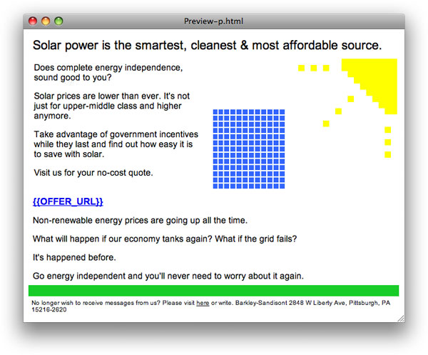
Solar Installation Service – Monkeyed Logo & Home from Site
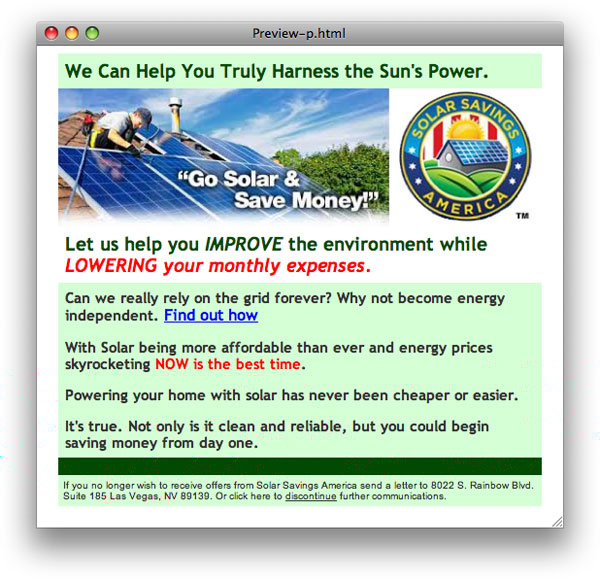
With this Solar installation ad, I just grabbed a screenshot of an install and the company logo to create the header.
I used a green color scheme to highlight how environmentally friendly alternative energy sources can be.
Predominantly HTML Tables – Minimal Images

With this Flexable Hose ad I created the "As Seen On TV" logo in Illustrator.
I also decided to have the word FREE in giant letters to show the value of impulse purchasing through this ad.
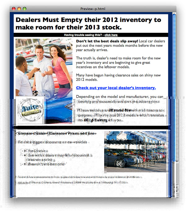
Auto Price Finder Service – 2 iStock Photos – Added Logo to 1

In this Auto Price Finder ad, I used a fiery hot red to emphasize the excitement of the couple purchasing their new ride.
Both photos were purchased from iStock and I superimposed the client’s logo to the first.
iPad Training Series – Hand Drawn iPad in Illustrator
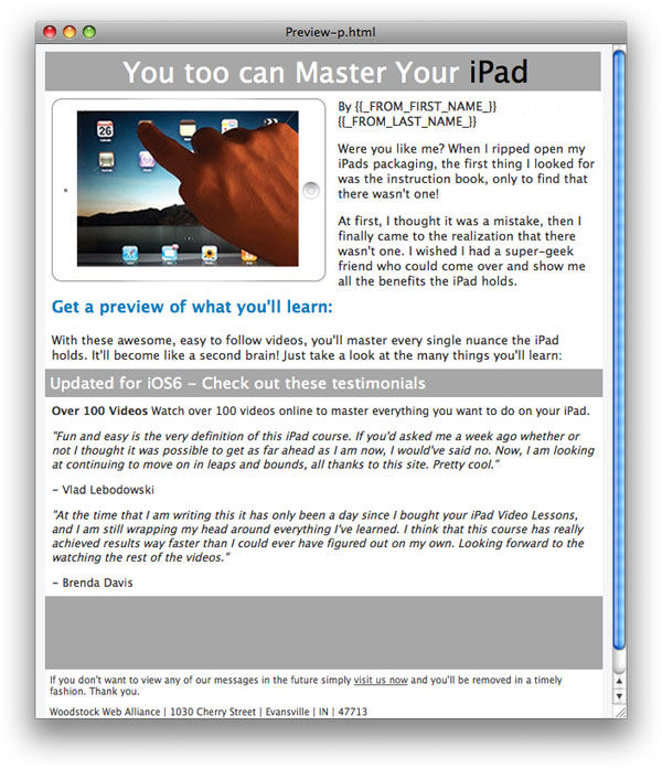
This was afun project, and since the trademark laws are so strict on iPad commercial photos, I decided to draw my own iPad "looking" tablet in Adobe Illustrator.
Turned out pretty good, don’t you think?
Auto Price Finder – Alternat Color Scheme
Here’s the same Auto Price Finder ad pictured above with a different color scheme.
Elderly Care Service

This ad was for retirement care services. I simply matched the blue background in the photo when creating the header.
Diet Supplement – 2 Images – Matched HTML Colors to Images
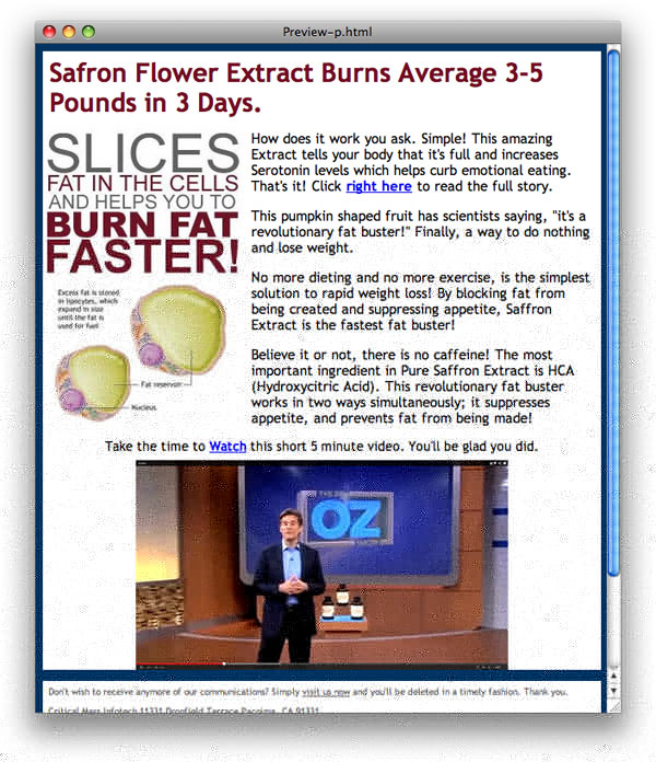
I created this Safron Flower Extract ad matching the Headline font to the fonts used in the original image.
The Doctor Oz video clip at the bottom shows that a leading health authority is convinced of it’s effectiveness.
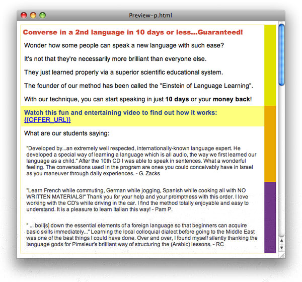
Pimsleur Language Learning – Matched Website – Minimal Image Size
There was a straight image creative produced by the client for the Pimsleur language campaign.
I just extracted the photos and used all HTML and CSS to match the background.
Health Supplement – Hand Created Vector Body In Illustrator

I hand created this image in Illustrator. I also matched the backround color to the chest image. Since it’s a blood pressure product, the blood red theme is memorable.
Green Coffee Bean Supplement – Matched HTML Colors to Image

This image is taken from the web page. I just matched the colors used for the headline and background.
Tag Away Ointment
Yet another instance where I monkeyed the images from the website. This one wasn’t too good of a retro fit for email, so the Photoshop work was a little time intensive.
It wasn’t a really good ROI, but sometimes you need to take a risk to be successful.
Lasik – Bought Face from iStock – Added Right Banner in Photoshop
I had to find a good eye closeup. I believe this one was a buck from iStock. I added the transparent banner and copy in Photoshop.
I matched parts of her hair, skin and eye color in the markup nad the blue background from the photo.
Auqua Rug – Matched Colors to Image
I monkeyed the image to the right from the client website. The rest is straight HTML markup. I matched the color scheme on the image itself.
Refinance Service – Blue Section is HTML
I essentially immitated the single image version from the client, but broke it up into slices and used actual text for the headline and compy section on the right.
Auto Price Finder – iStock Image w/ Matching Color Scheme
This ad uses two iStock images. I superimposed the logo on the car lot using Photoshop. The border color matches the ocean in the top photo. The staggered images gives it a more full look.
There are many more examples I could post, but I believe there’s enough here for someone to get a flavor for my skills.